-
-
1.
Promo
0:48
-
2.
Introduction
2:19
-
3.
Project briefs
2:56
-
4.
Let's talk type
6:05
-
5.
Personality of a typeface
10:24
-
6.
Using type in logo design
4:53
-
7.
Combining multiple typefaces
7:21
-
8.
Buying typefaces
1:55
-
9.
Type hierarchy
4:17
-
10.
Body copy
3:02
-
11.
Final thoughts
2:05
-
Choosing the Right Typefaces: How to Enhance Your Message with Type
Faye Brown, Faye Brown Designs
About This Class
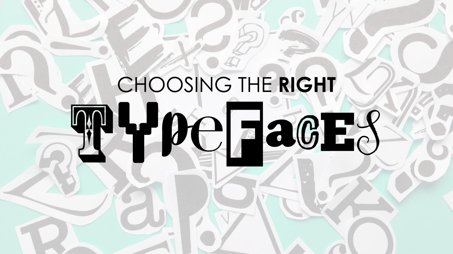
This class is for all those who would like to know more about how to choose the right typefaces for your design work. The typefaces you choose to use in a design or illustration will be communicating a message to the viewer and you want to make sure that message is the right one. Sometimes typography needs to be almost invisible, so much so that we take it for granted... other times we might need to read a billboard from a far or a warning sign and we want to make sure our message stands out.
We will look at how one word can take on different meanings just by the typeface you read it in.
This class is for designers, illustrators, pattern designers and animators... anyone who uses type in their work and would like to know more about choosing the right typefaces for their projects.

Class Projects Show All (27)




Please note that this class is provided for personal educational, informational and convenience purposes only, is general in nature and is not intended as a substitute for professional, legal, or medical advice. Read more about this in our Terms of Service.